Reprinted from Byte, issue 8/1984, pp. 238-251.
The Apple Macintosh computer
Few computers – indeed, few consumer items of any kind – have generated such a wide range of opinions as the Macintosh. Criticized as an expensive gimmick and hailed as the liberator of the masses, the Mac is a potentially great system. Whether it lives up to that potential remains to be seen.
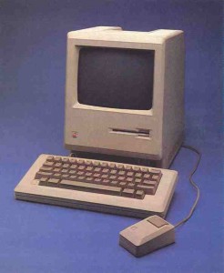
Personally, I think the Macintosh is a wonderful machine. I use one daily at work, and then at night I play with the one I have at home. Or, at least, I try to play with it. You see, my wife – who for years resisted all my attempts to introduce her to computers – has fallen in love with the Mac (her words, not mine). She uses it to type up medical reports, notes on her clients, and personal letters. In fact, she’s suggested that we get a second Macintosh so that we won’t have to fight over the one we have.
The Macintosh is not without its problems. Resources are tight – it needs more memory and disk space – and software has been slow in coming to market. Many have criticized its price ($2495). In fact, there are indications that Apple considered a lower price ($1995) and then rejected it. It doesn’t seem to have hurt the Mac’s market – people are still buying them faster than Apple can make them – but there’s the potential for backlash if the machine doesn’t deliver on all its promises.
Whatever its problems and limitations, the Mac represents a breakthrough in adapting computers to work with people instead of vice versa. Time and again, I’ve seen individuals with little or no computer experience sit down in front of a Mac and accomplish useful tasks with it in a matter of minutes. Invariably, they use the same words to describe it: “amazing” and “fun.” The question is whether “powerful” can be added to that list.
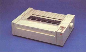
In an industry rapidly filling up with IBM PC clones, the Macintosh represents a radical departure from the norm. It is a small, lightweight computer with a high-resolution screen, a detached keyboard, and a mouse (see photo 1). It comes with 128K bytes of RAM (random-access read/write memory), 64K bytes of ROM (read-only memory), and a 400K-byte 3½-inch disk drive. If you throw in an Imagewriter printer (see photo 2 and figure 1) the system costs $2990. The processor is a Motorola 68000, running a name-less operating system (see the text box, “A Second Opinion” on page 248 for a fit description). It has absolutely no IBM PC/MS-DOS compatibility, and it would appear Apple plans none.
The Display
The display is small (9-inch diagonal), but it has very high resolution (512 by 342 pixels). Every pixel is crisp. Several things make the display unusual. First, the Macintosh has no “text mode.” Instead, the display is always bit-mapped graphics. Second, the display is black-on-white rather than amber-, green- or color-on-black, giving it an ink-on-paper effect. Third, the pixels are equally dense both horizontally and vertically, eliminating the “aspect ratio” problem that plagues other graphic systems. (In other words, a box 20 pixels wide and 20 pixels high will be a square.)
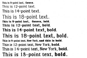
The effect is excellent. The display is clear, crisp, easy to read, and easy on the eyes. Because all text is graphically generated, the “what you see is what you get” word processing is available (with multiple fonts, sizes, and styles). Embedded drawings and proportional spacing are also possible. Some criticism has been made about the lack of a color-graphics capability. Frankly, I am unconvinced of its necessity. Most applications I have seen use color graphics as a substitute for detail, and the Mac can give you lots of detail. (An interesting footnote: the QuickDraw graphics routines in the Mac’s ROM do provide for color, although Apple has not announced any intentions for supporting such.)
The Mac’s display does create a problem. Computer graphics are memory-intensive, once you start drawing pictures, you start using up lots of memory. The video display itself consumes about 22K bytes (or about one-sixth) of the total RAM. Any off-screen manipulation (windows) or information (fonts) chews up additional memory quickly.
The Keyboard
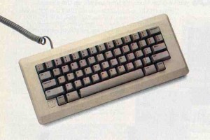
Note the absence of a control key, but the presence insteaf of a “cloverleaf” key just to the left of the space bar. This key performs several of the functions usually performed by a control key
Like the rest of the machine, the keyboard is significantly different from those found on other systems (see photo). It’s smaller than most and has only 58 keys. It is detached but the 3-foot coiled cord has lots of give to it so you don’t have to wrestle the computer for the keyboard. The full printable ASCII American National Standard Code for Information Interchange) set is available, and the layout of alphanumeric and punctuation keys is pretty standard. There are no function keys, no cursor keys, and no control key. Instead, you will find two Option keys and a Command key. The Option keys, located directly under either Shift key, are used to generate special text characters (Greek letters, math symbols, and the like). The Command key, whose symbol looks like a freeway cloverleaf, is an alternative to the mouse. For example, if I’m typing along and wish to underline some text, I can type Command-U instead of stopping and using the mouse to select Underline in the Style pull-down menu.
All in all, I like the keyboard. I’m a fast touch-typist and occasionally I overrun the two-key “rollover” (the number of keys you can press down simultaneously), but I never lose characters because of buffer overflow. The keyboard’s layout is compact, so I can easily reach any key – well, almost any key. The Command key, located between the left Option key and the space bar, is in an awkward position. often hit the Shift key or Option key instead. I don’t like function or cursor keys and the mouse renders them fairly useless, so their absence doesn’t bother me at all. A separate numeric keypad is available for $99 (it plugs in between the keyboard and the Mac). This keypad has cursor keys on it, but I wonder how many applications will recognize them.
The Mouse
The Macintosh has a standard, one-button, mechanical-tracking, optical-shaft-encoding mouse (again a departure from industry norms). The mouse has a 3½-foot cord, its own port in the back, and full support from the ROM routines and the operating system. In other words, almost every application on the Macintosh will use the mouse. (I say “almost” because someone is bound to come out with a program that ignores it altogether.) Before buying my Macintosh, I used a mouse on an IBM PC and was not impressed. The Macintosh mouse impresses me. In some applications, such as MacPaint, I seldom touch the keyboard, except to hold the Shift, Option, or Command key down with my left hand while moving the mouse with my right. I find using the mouse faster, easier, and less disruptive than using function and cursor keys. Function and cursor keys do not fall within the standard touch-typing layout because they vary in size, number, position, and function. To use them, I have to stop and think about what key I need, look down at the keyboard, find it, hit it, and look up again. Often this process has to be repeated several times. With the mouse, I never take my eyes off the screen. I just reach to my right, grab the mouse, and do what I need to do.
Of course, the mouse isn’t always a perfect solution. Some commands can be tedious to perform via the mouse and pull-down menu. For example, deleting text to the right of the cursor in MacWrite can only be done with the mouse. This is a nuisance if you have only one or two characters to delete. I’d also like the mouse’s cord to be a little longer and sometimes I have trouble finding enough surface area to work the mouse, but these are minor complaints. The mouse is an excellent feature of the Macintosh.
User Interface
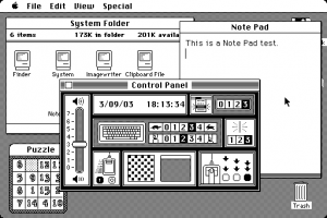
Macintosh’s user interface is far different from those of other personal computers. Strictly speaking, it is not all that new. The original concepts were pioneered at Xerox’s Palo Alto Research Center (PARC) several years ago. Apple used them heavily in the original Lisa machine, released a year before the Mac. However, that Lisa sold for $10,000, and the Xerox machines for much more. The people who most needed the interface were those who could least afford it: small business people, students, etc. The Macintosh is still a bit expensive, but it’s within the reach of far more people than any of its predecessors.
In creating the Macintosh’s unique user interface, Apple has attempted to make the abstract seem concrete. Few things are as abstract as the data and programs stored and used on a computer. The Mac takes that abstraction and presents it as something familiar a desktop cluttered with pencils, papers manila folders, and even a wastebasket. Do you want to put a document in a folder? Pick it up with the mouse and put it in the folder. Do you want to throw something away? Pick it up and put it in the wastebasket. Abstractions take on real forms that we can understand and use without obscure commands or bizarre syntax.
Another important aspect of this user interface is the way in which the Macintosh makes commands available to the user. As I write this review with MacWrite, the top of my screen has an Apple symbol and six words (File, Edit Search, Format, Font, and Style) written across the top. If I point at any of the items with the mouse and press the button, a menu of options appears on the screen. When I release the button, the menu disappears. All available commands appear in the menus. I haven’t had to memorize or learn much; in fact, I opened my MacWrite manual only once or twice, briefly. The same is true at the “desktop” level. Any actions can be performed via the pull-down menus or by direct “physical” manipulation of the objects shown. The best feature of the Mac documentation is that I almost never have to refer to it.
My one complaint about the user interface is that it’s slow. Sometimes running a program or opening a file seems to take longer than it should. File copying on a one-drive system is also tedious.
A special disk-copy utility is now available that lets you copy an entire disk in just four swaps – not too shabby when you realize that this utility uses nearly 80 percent of the total RAM just to hold the data. Unfortunately, this utility won’t solve the problem of copying several files onto a disk that’s already formatted and in use. There is a simple solution: more RAM.
Memory Limitations
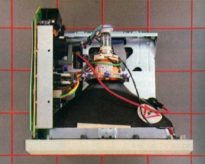
The 68000 is a powerful microprocessor but it has a limited environment in the Macintosh. The Mac comes with 128K bytes of RAM: less than 1/100th of the 16-megabyte RAM the 68000 could use, and there’s no way to expand it. True, Apple is planning to upgrade the Mac to 512K bytes sometime in the future, but that still leaves 97 percent of the potential memory space unused and unusable. The Mac has no provisions for expanding memory beyond replacing the 64K-bit chips it currently uses with 256K-bit chips as they become available. It has no expansion slots and no external bus. And remember, this is a graphics-intensive environment where memory often gets eaten up rather quickly.
So the question arises: why did the Macintosh design team so limit their machine? The most common reason I’ve come across is that the Macintosh team wanted to provide a standard environment for software developers and users (although the latter is less often cited). In other words, software developers know that a Mac will always have 128K bytes of RAM and users will never have to worry about software requiring more RAM than they have. The idea is sound, but it causes two problems. First, 128K bytes is not enough RAM for a standard, especially in the Macintosh environment, where graphics chew away at your free space. Second, there will be no standard for software developers when the 512K-byte upgrade becomes available. Many software developers are ignoring (or unable to use) the 128K-byte machine and will release the packages for 512K-byte machines only. Unless Apple plans a free update to all Mac owners, the standard environment will no longer be standard.
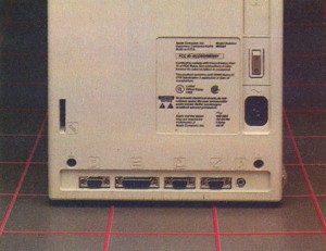
Another argument I’ve heard to support the concept of such limited memory is that the expansion slots were dropped to avoid power and cooling problems and to keep the user out of the machine. Again, this is a good idea if you provide sufficient resources in the unexpandable model. I have no complaints with Apple’s choice of two RS-422A ports, an external disk port, the mouse port, and audio output. External video would be nice, but it isn’t critical. But there’s just not enough memory.
Others argue that 128K bytes of RAM is enough because so much of the work is done for you in the 64K-byte ROM. The ROM toolbox (the optimized 68000 machine-language routines that handles all aspects of the user interface) is truly a marvelous thing, but it doesn’t change the fact that large, complex programs need lots of memory, especially if the displays are all graphical. A supporting argument points to MacPaint and MacWrite, saying, “See, these work fine!” Yes, they do, but both have easily reached limits. Furthermore, these programs were developed over a long period of time, concurrently with the Macintosh. The authors of these programs knew a lot about optimizing code for the Mac. Software developers with less time and more ambitious designs will find the lack of RAM a serious roadblock.
I also have heard that the upgrade to 512K bytes will eliminate all such problems because there will be more than enough RAM for any application. Again, I disagree. You can never have enough RAM. I think it’s no accident that the Commodore 64, with 64K bytes, has dominated the low-end market over machines that have (or had) 8K, 16K, or 24K bytes. Apple gave the IIc, which uses an 8-bit 6502 chip, 128K bytes of RAM. Why the company limited the 68000, a 32-bit chip, to the same initial amount of memory is beyond me. Even the fourfold upgrade is too limiting. Apple delights in stating how much better the 68000 is than the 8086/8088 chips used in the IBM PC and compatibles, yet most of those systems can use more RAM than the Mac. Where’s the advantage?
Obviously, I think that 128K bytes is not enough RAM to make the Macintosh a truly powerful machine. My attempt to run the Sieve of Eratosthenes benchmark on the Mac provides one indication of its RAM limitations. Once BASIC was loaded into the Mac, there was too little space left in memory for the Sieve program. To fit the program into memory, I had to declare all variables integer. This will, of course, speed the execution time considerably. Thus, the speed of the Mac Sieve is not commensurable to the other two systems. (If you are curious, the modified benchmark took 96.4 seconds on the Mac.) The upgrade to 512K bytes will help considerably, but it’s still an inexcusable limit. I am convinced that this limited RAM has held up the release of Mac software. As I write this, it has been three months since the Macintosh was released, and all the Apple dealers in town have only three software packages for the Mac besides MacPaint and MacWrite, which are still bundled. Mac should have had at least double the initial and upgrade RAM, i.e., 256K bytes and 1 megabyte, respectively. It may be that Apple will release yet another upgrade when 1-megabit chips become available in mass quantities, or they may just release a new machine.
Although the RAM is a limitation of the Macintosh, the ROM is a tremendous strength. In what is undoubtedly one of the marvels of modern programming, the Macintosh design team crammed an unbelievable amount of power into the 64K bytes of ROM in the form of tightly written, highly optimized machine code. In doing so, the team provided standard user interfaces, so that most application programs on the Mac will be used in similar forms. I tried some prerelease programs with no documentation and I was able to use them almost immediately. Try that under CP/M or MS-DOS. The ROM toolbox is a vital facet of the overall amazing nature of the Macintosh.
The Macintosh also lacks adequate mass storage. At first, it doesn’t look bad: it consists of one single-sided 3½-inch built-in disk drive (made by Sony) holding 400K bytes. Having only one disk drive can be a nuisance, but it’s acceptable if the drive holds enough data and if you can copy it easily. However, the system files on a Macintosh disk take up over 200K bytes, or half the disk. Even with trimming, you only have about 220K bytes of usable space on a bootable disk. If any other company marketed a CP/M or MS-DOS system with a single disk drive with only 220K bytes of free space, no one would buy it. It takes a lot of time and disk swapping to copy files or to back up a disk. The Mac’s only saving grace on this point is that it automatically ejects the disk and prompts you for a new one.
The 128K-byte Macintosh with one single-sided drive is not a powerful machine. You can do useful work with it, and the user interface beats all other cold. But for the same price or less you could go out and buy, for example, a Compaq with 256K bytes of RAM and two 360K-byte disk drives. And I could get lots of software for it – programs that can handle larger, more difficult tasks than the Mac currently can. The upshot is this: a $3000 Macintosh with 128K bytes of RAM, a 400K-byte disk drive, and an Imagewriter printer, is an amazing machine but not really a powerful one. A 512K-byte Mac with two 400K-byte disk drives is both amazing and powerful, but it is also expensive ($3500, including printer and not counting any cost for the RAM upgrade). In the two-and-a-half months that I’ve owned my Mac, I’ve often wondered if I should have bought one so quickly. However, the arrival of MacFORTH (see the text box “Software for the Mac” on this page) has done much to quell my reservations. I can now create my own windows, graphics, and pull-down menus, and the “fun quotient” of my Mac has made a quantum leap. Besides, I suspect that by the time this sees print, prices will have dropped and the software base will have expanded considerably.
Conclusion
You won’t find another machine that’s as easy to use or as much fun as the Macintosh. In the right configuration, it can do as much as any microcomputer on the market. However, you should go for a 512K-byte system with two disk drives and a printer. Anything less and you’ll find yourself frustrated by the machine’s limits.
I have no doubt that I would have bought a Macintosh sooner or later, and I have no intention of getting rid of the one I own. The Mac’s a gem – rough, slightly flawed, but a gem nonetheless.
by Bruce F. Webster
Bruce F. Webster (7909 Ostrow St., Suite F, San Diego, CA 92111) is vice-president of FTL Games and Oasis Systems. He received his B.S. in computer science from Brigham Young University and did graduate work at the University of Houston. His hobbies include reading and war-gaming, especially science-fiction and fantasy war games.
